This condensed 10-minute video will guide you through the process and give answers to these questions. A couple of points are emphasised down below, while the full report is available here for a deeper insight.
Goal
The objective of this work was a) to examine the relation between typographical body and the character, meaning and temperament of words that carry its form and b) to examine the perception of a global brands’ logotype (textual part of a logo) and measure on how their typography is perceived by observers to see if the font family itself corresponds to values and/or tone of voice the same brands wanted to exhibit.
Process
The selection of famous brand logos has been chosen from a range of diverse industries. After identifying the typography for each, they have been presented in a “neutral” environment, stripped from any brand recognizable visual artefacts, colours, titles, taglines and then compared against a series of qualitative descriptors to see if their form matches the industry and emotional aspects they wanted to instil.
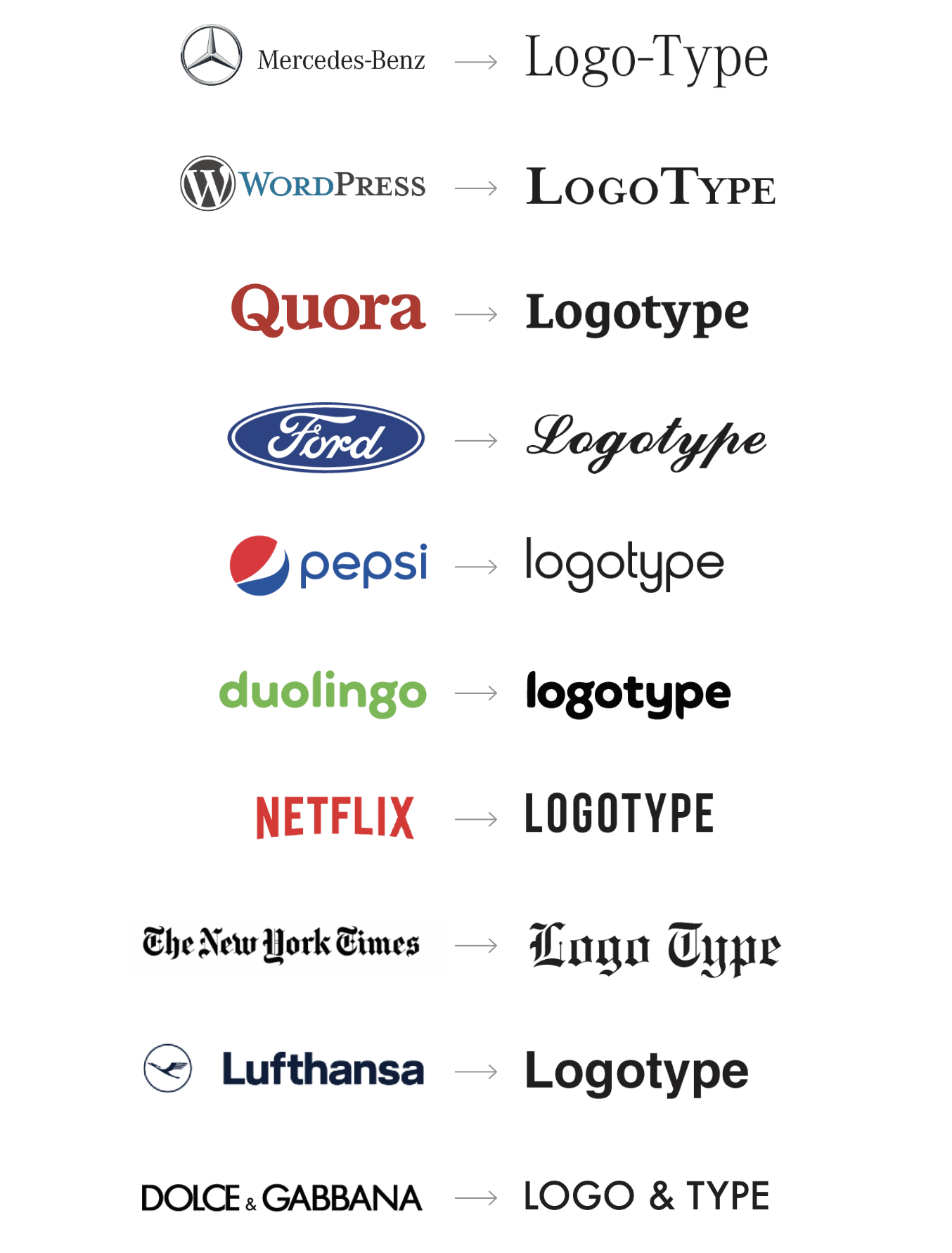
They were then compared against a series of qualitative descriptors to see if their form is appropriate in regard to their industry, values they wanted to convey, brand positioning, target group and product type they were offering. This was formulated in a string of 7 descriptive keywords tied to each of these neutralised logos.
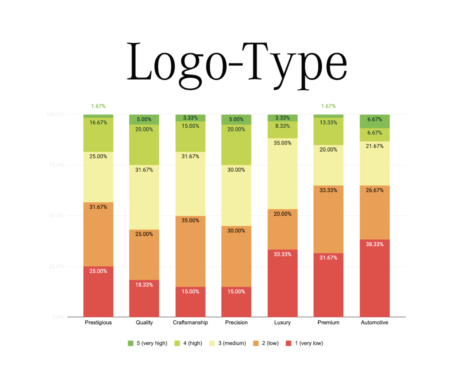
In the first stage, each participant was given 10 neutralised logotypes and 7 keywords. They were asked to grade how they thought that particular typography is appropriate in connection to a distinctive keyword. They did not know which brand they were grading, or if this was any particular brand in question. One logotype was shown at the time with 7 keywords. The Likert scale marked very low (1), low (2), medium (3), high (4) and very high (5) appropriateness rating.
Work that was developed during the research stage was two-fold:
a) Mock typography for each of these brands was developed. Its purpose was to create tension, to oppose the tone of voice it was supposed to convey, to shock the viewer and contrast the keywords. It was supposed to be inappropriate on many levels.
b) Also, two alternative logotypes for each brand were developed to represent the keywords in the best way.
In the following stage, the same participants were asked to choose the most appropriate logotype that will best represent a whole set of keywords. This was the same set of keywords as shown in the first stage. For each brand, they were presented with 4 choices. The original brand typography, one mock version and two alternative options. The choices were randomised within each question.
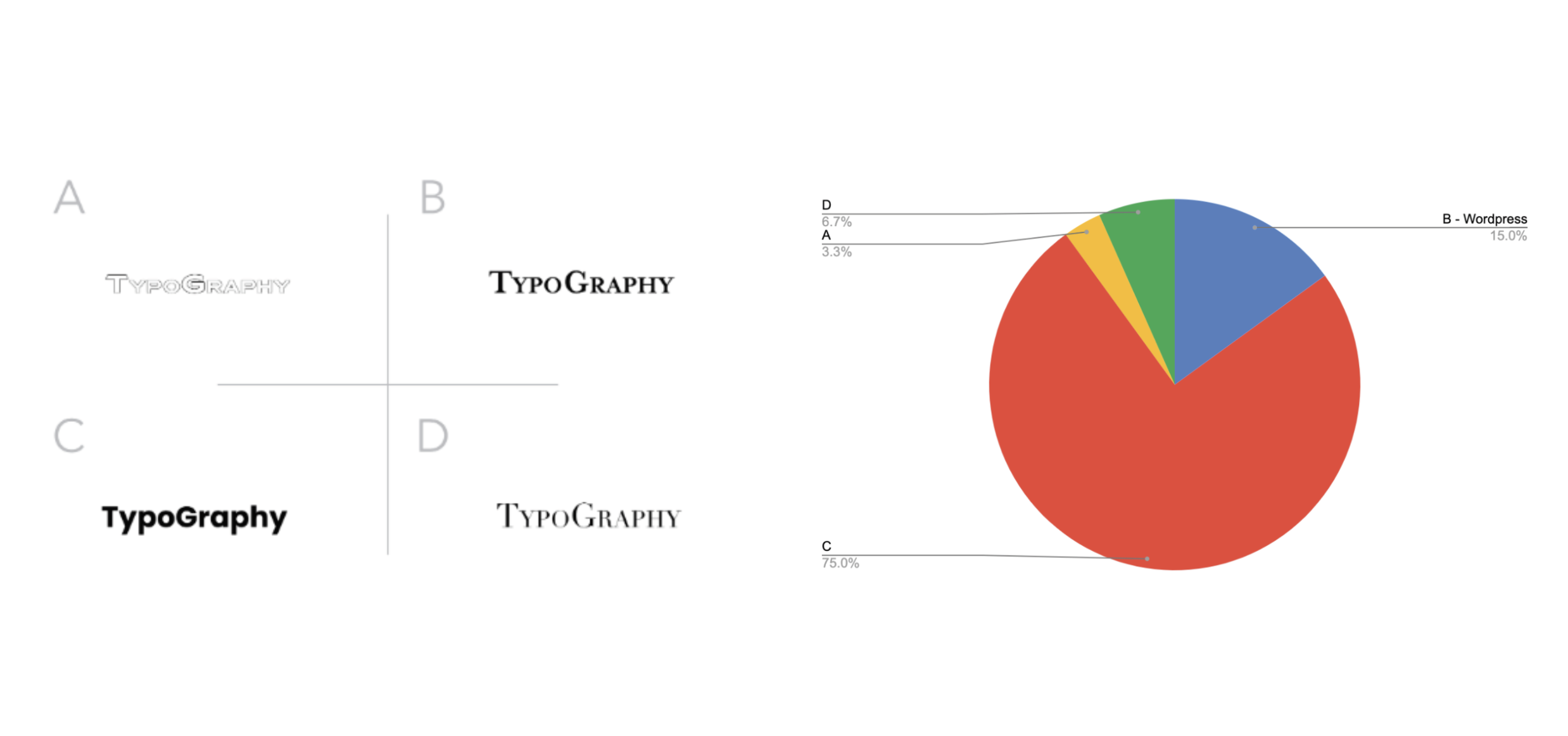
In 6/10 questions none of the 60 participants chose the mock typography as appropriate.
Two participants had strong reactions and reported that they were not able to proceed with the questions as they were upset with the presented choice.
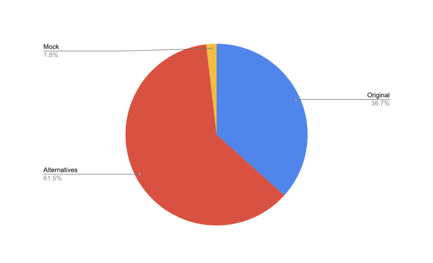
Overall the study has shown that participants on average deemed alternative typography as more appropriate than the original one. On an individual level, Netflix and Duolingo had high choice rates in favour of their current typography. 63,3% of participants voted Netlix’ active typeface as most appropriate and 66,7% of participants voted Duolingo’s active typeface as most appropriate when presented with the 4 choices.
Outcomes
The final work is the sum of these study results. All findings were used to transform visual identities following the appropriateness score. These are some of the developed logotypes and logomarks.


Conclusions
The original aim of this project was to see if people perceive typographic appropriateness and inappropriateness and to what extent. A secondary goal was to see how typographic personality affects their perception of a brand in a neutral environment. The tertiary goal was to produce practical work based on the findings. All three aims were successfully reached with valuable insights.
Three limitation themes need to be taken into the account:
1) Considering that 93% of participants work in a creative field, they might not represent each brand’s target group. Future research could benefit from wider demographic inclusion and a bigger sample number.
2) Sterile testing environment has brought out genuine reactions. This has an intended effort. However, it has also prevented participants from absorbing additional brand elements like colours and symbols that play their role in how one brand is perceived. Future tests can be done to include the brand’s established tone of voice to see how other elements score in comparison to typography both individually and overall.
3) The choice of keywords might not represent the core representation of each brand. Future studies can include a pre-testing phase where different participants will be able to pick from a pool of words items that have the highest association in regards to a brand. Most picked words will then be presented to another group as base keywords set against which typographic appropriateness will be tested in a neutral environment.
Schriver (1997) suggests that designers and business should take into account typographic research, as it allows design decisions to be based on rational findings rather than just on personal preferences. This body of work aligns with his findings as it shows that we subconsciously recognize, assign and absorb typographic personality along with the meaning of the text. Brands can and need to leverage typography to establish a better connection between the form of their logotype and the personality they want to evoke. This can be achieved through a series of neutral typographic appropriateness tests like the one established during this project.
Access full report