RTCG
Introducing a transformative design for Montenegro’s national broadcaster, as well as sub-brands, radio channels and online platforms. The strategic overhaul provides more breathing space between the visuals, simplifying expression in a consistent manner to turn it into a flexible and recognisable symbol. The summary below is a snippet from an extensive elaboration spanning over 100 pages.
ClientRTCGFieldIdentity, Branding, StrategyDateOctober 2023
New vision
Since May 1964, the official start of Television of Montenegro’s operation – formerly Television of Titograd – its visual identity has consistently relied on the acronym, later combining national attributes. Through continuity, we respect what has preceded us while envisioning the future.
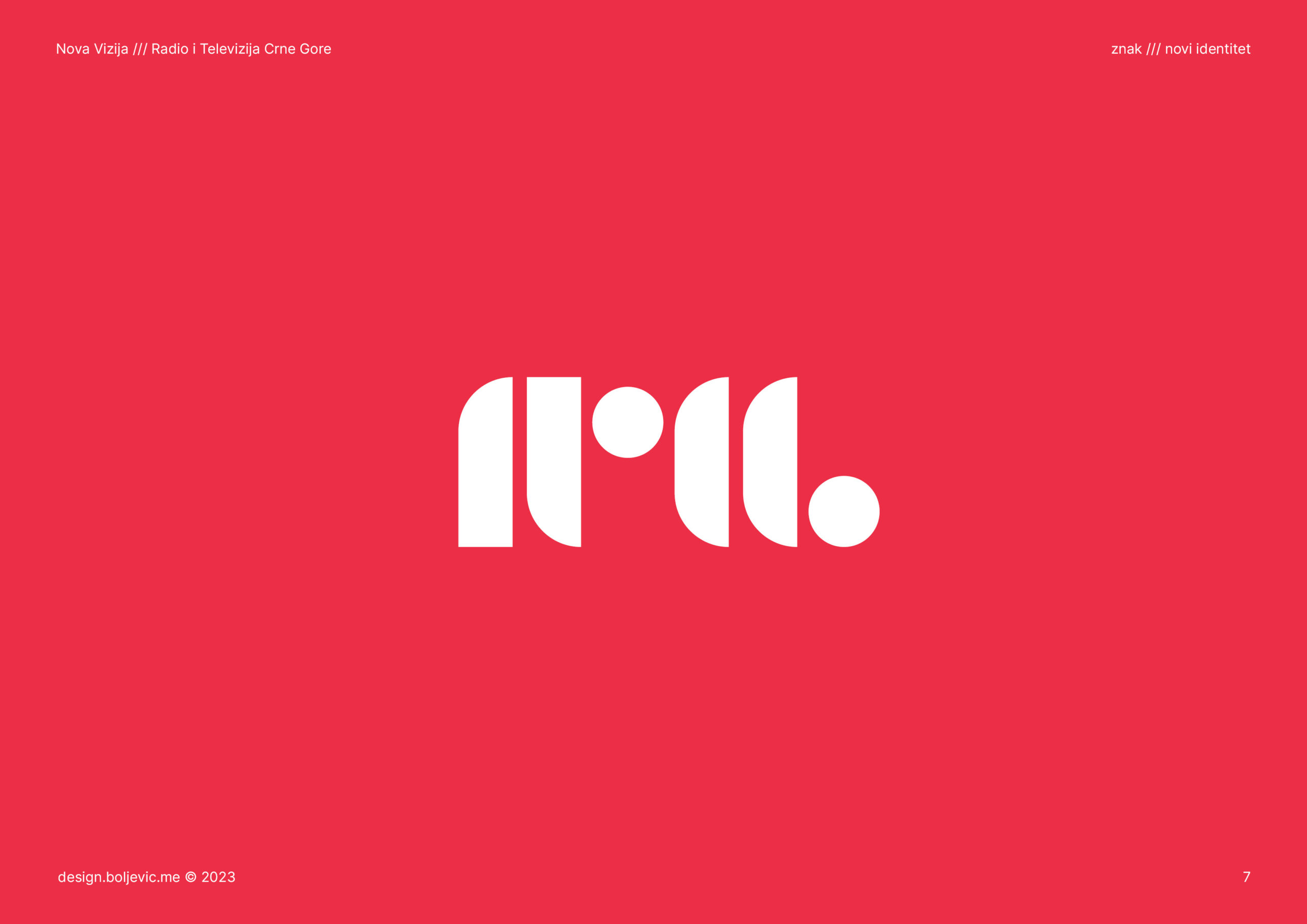
Symbolism
In resonance with the vibrant tapestry of Montenegro's populace, encapsulated geometric motifs represent a kaleidoscope of diversity. Despite their disparate forms, positions, and interrelations, they converge seamlessly through the unifying red, forging unity within the composition.
Form
The new symbol represents a combination and is inspired by the lines of 1964, brutalist geometry of RTCG in 1989, the circles of 1991, and the dominant red in 2006. The symbol is complemented by a sans-serif inscription following the last two logotypes.
Function
The symbol's simplicity allows for effortless replication across digital and print platforms. Its individual elements offer creative possibilities for both stationary and dynamic graphics. It maintains exceptional clarity across various applications, ensuring a distinctive and contemporary identity that fosters recognition and association.
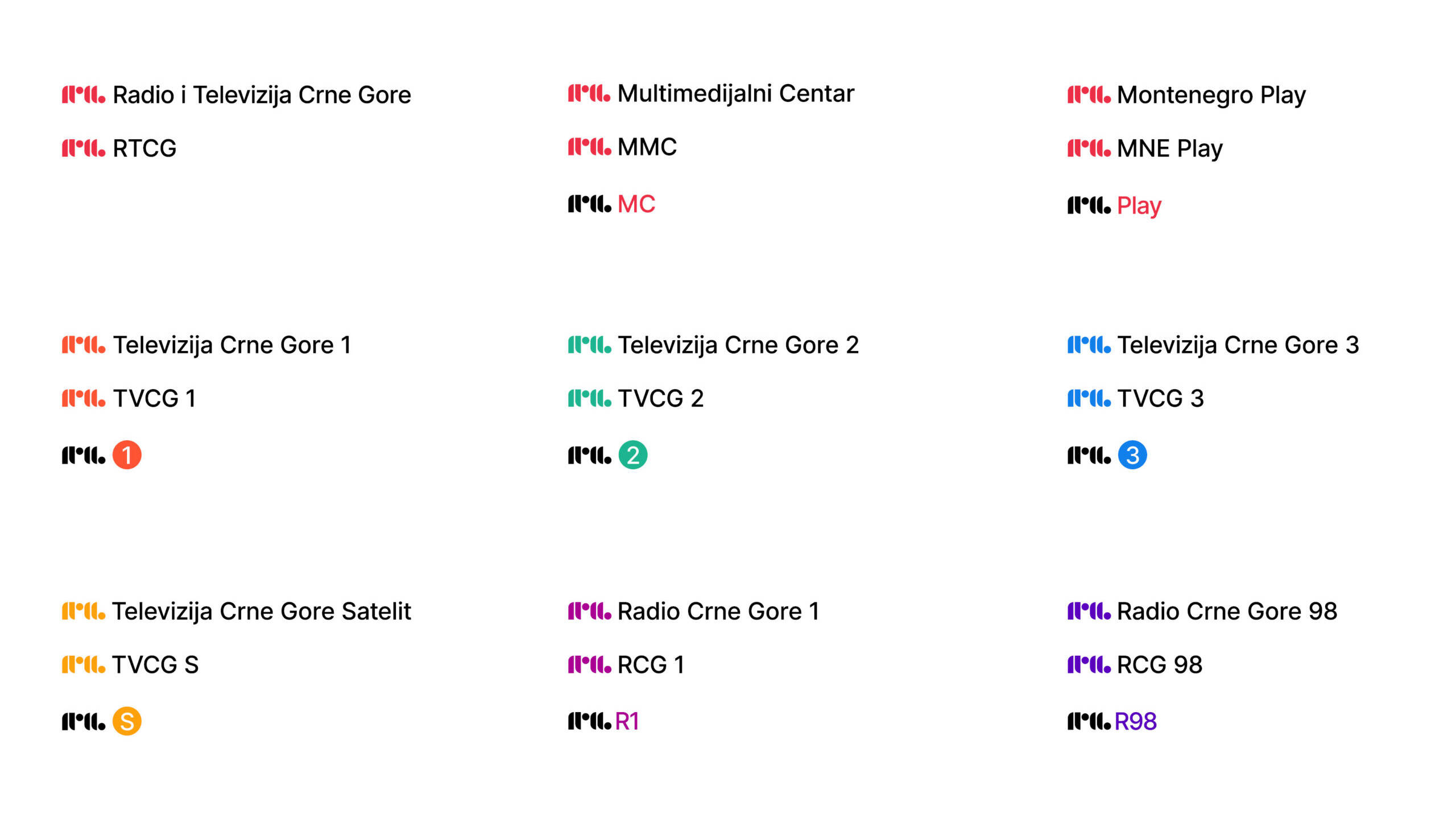
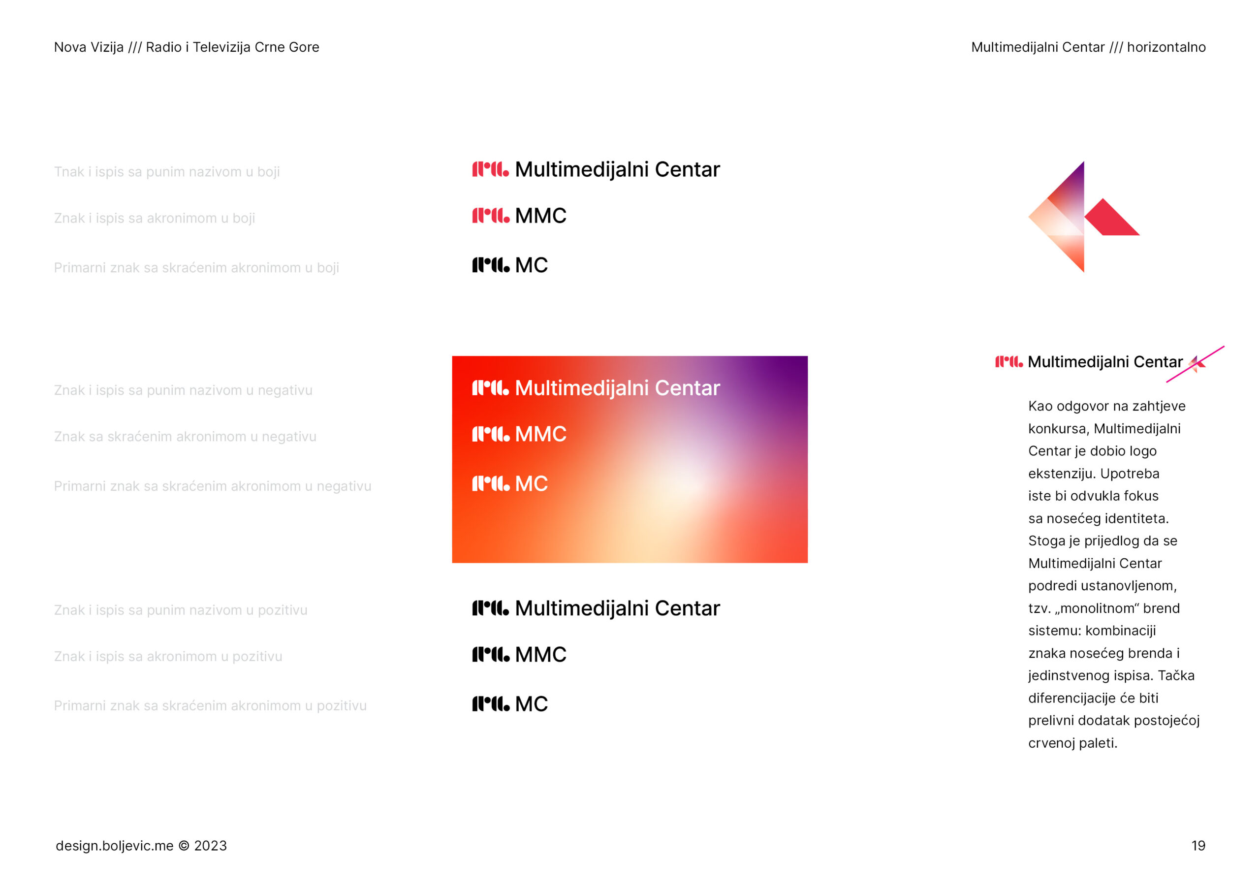
Brand architecture
Monolitchic
Monolithic architecture (or branded house) is characterized by a strong, single master brand. RTCG brand extensions use the parent’s identity with descriptors and their characteristic colour or gradient.
Organised and unambiguous
By reducing graphic complexities, we alleviate cognitive fatigue. With simplified visuals, the message recipient can focus on information of primary importance while recognising the sender at all times.
In use examples
Brand deployment and utilisation
Playing with the shapes that constitute the symbol enhances the brand’s presence. Through headlines, captions, animations, smaller graphics, etc., the visual identity is established in two-dimensional form.
The T-shirt application provides a three-dimensional representation of the symbol, where the edges on the sleeves and buttons materialise brand elements in physical space. Similarly, locations outside the office are marked with flags in the same form for familiar spatial marking.
The simplicity and applicability of these forms provide plenty of opportunities, and their potential should be fully leveraged.